Recurrence
One of the most important mathematical concepts is waves. Waves are described by sine functions oftentimes as an aggregation of multiple functions with different wavelengths and phases.
This article describes, how artificial intelligence analyzes datasets fitting a model on the patterns found.
Copyright© Schmied Enterprises LLC, 2024.
Link of the day
Dive into the fascinating world of the Lotka-Volterra equations, exploring predator-prey dynamics and mathematical modeling.
Learn More
Regulatory:
Read about the alleged takedown plot of startup Toptal orchestrated by tech investor Denis Grosz.
Learn More
Link of the day
Explore Reflex, a research-proven program designed to help students in grades 2-6 master basic math facts.
Learn More
Link of the day
Discover Project Gutenberg, a vast library of over 75,000 free eBooks available for download.
Learn More
Link of the day
Access Common Crawl, a free and open repository of web crawl data spanning 18 years and containing over 250 billion pages.
Learn More
Link of the day
Learn about the OSCAR project, an open-source initiative providing multilingual resources for machine learning and AI applications.
Learn More
Link of the day
Delve into the world of microchips, understanding their structure, manufacturing process, and significance in modern technology.
Learn More
Link of the day
Explore the intricate process of making a microchip, from silicon wafers to complex circuitry.
Learn More
Link of the day
Learn about the IEEE TryEngineering ON Semiconductor Grant and its impact on STEM education.
Learn More
Link of the day
Discover DDN, a leading data intelligence platform provider for AI and HPC solutions across various industries.
Learn More
Link of the day
Gain insights into the transformative potential of AI in software engineering, exploring its impact on development processes and practices.
Learn More
You can measure wave patterns in physics or economics. Interestingly, if your sampling rate is high, you will see a sine pattern. If your sampling rate is low, you will just see a reasonably stable mean and variance. The variance will have the same characteristics as the variance of a clear sine wave, suggesting the model with confidence.
Such a pattern is very common in nature. However, the differential equations that describe them are quite complex. Each point is described by two parameters. The aggregate of one is weakened by the aggregate of the other with a linear function.
To understand it better, we can consider the common example of the fox and rabbit problem, or Lotka-Volterra equations. A fox eats a rabbit if they encounter one another in the forest. The probability of this meeting is proportional to the number of foxes and rabbits. The more rabbits there are, the higher the likelihood of an encounter. The more foxes there are, the higher the likelihood as well. However, each encounter reduces the number of rabbits, and with fewer rabbits, fewer foxes can survive.
This negative feedback loop is similar to a resonator in some memory devices. It also describes police and crime patterns, as well as the dynamics of wildlife populations in forests. All of these examples result in two interwoven sine patterns.
Smart foresters recognize this by collecting data from their forests. They can manage and even smooth out the population curve by culling some animals in the right season.
Crime follows a similar pattern. If a reported crime is not investigated, crime rates will likely appear to improve. Conversely, if officers have nothing to do, they may collect data and harass citizens, creating the opposite pattern. A good municipal policy ensures that reported crimes are investigated and that no one fabricates cases, resulting in a stable crime rate.
House prices are a good example to illustrate how artificial intelligence analyzes data.
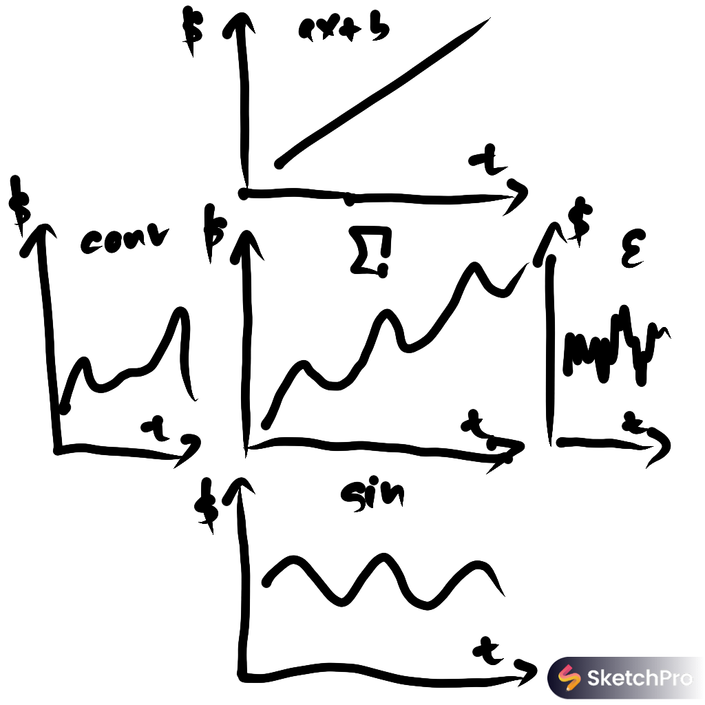
Imagine a chart showing an artificial house price curve over time. The middle chart represents the initial aggregated data. Model training will identify the main component first, finding a huge variance with every parameter except one. The variance will be reduced significantly if the house price data is fit onto a linear function (ax + b), representing overall growth and increased buyer income over time.
Some variance will remain unexplained. You can see a sine wave with a lower amplitude added to the house price curve. It is common for house prices to fluctuate throughout the year. This annual recurrence can likely be attributed to factors like bad weather prompting homeowners to consider moving. This sine wave is a result of two variables: the Earth's angle relative to its orbital phase, as depicted in the bottom chart.
There is more to consider. Even after accounting for economic growth and seasonal impacts, some variance remains unexplained. This is where the left chart becomes relevant. We see the impact of an aggregate of sine waves, each described by events with negative feedback loops, like the fox and rabbit example. This predator-prey pattern applies to multiple factors, including crime rates, aging infrastructure, education, and job opportunities. These all follow a wave pattern over time, often mitigated by society when issues are recognized and addressed.
Communities eventually recognize these patterns, take collective action, and house prices return to a stable track. What remains is a little variance described by epsilon on the right.
